UX/UI designer @ Denso
Fleet Management System

Designing a fleet management interface that helps managers and drivers make smarter, faster decisions with less friction and more visibility

MY ROLE

PROCESS
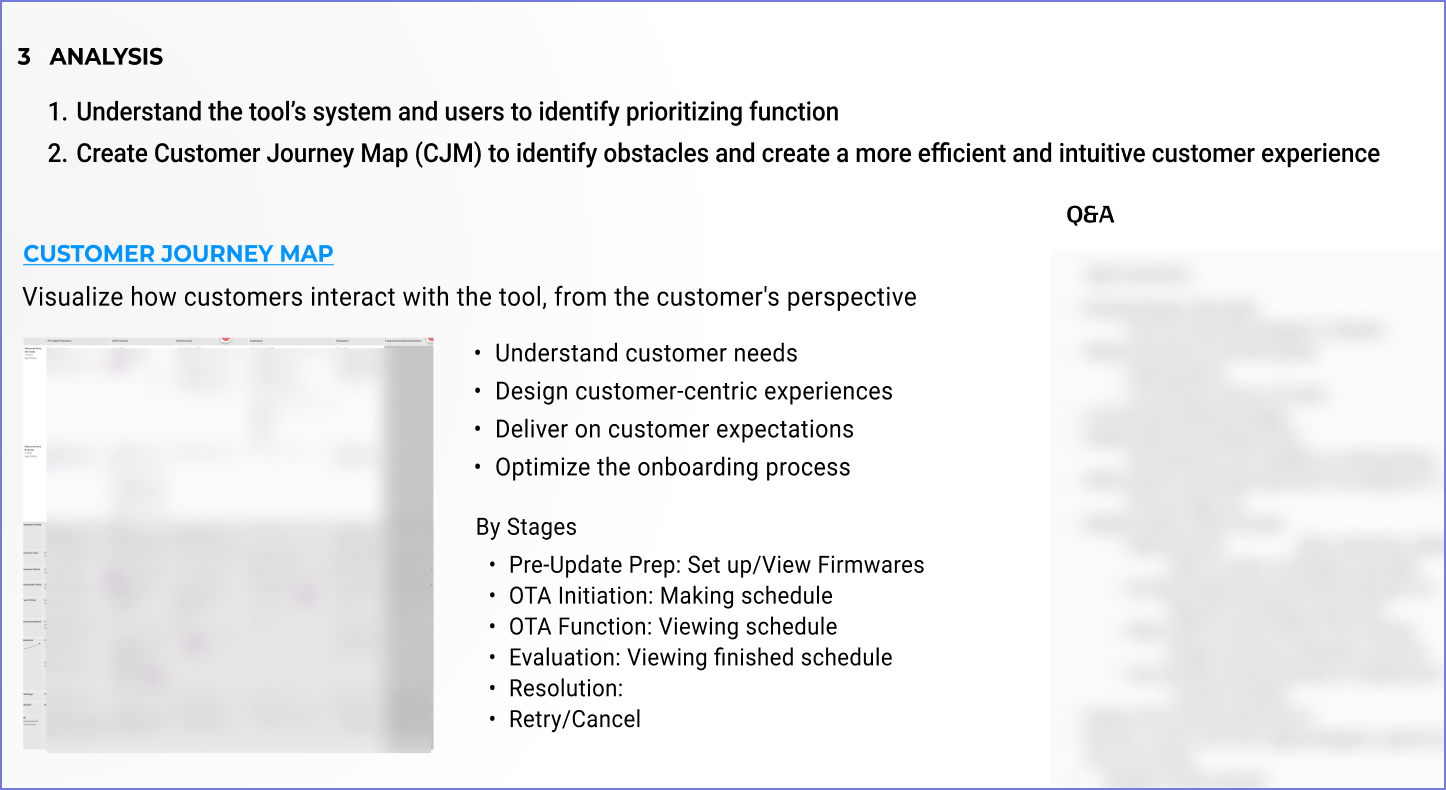
RESEARCH
Fleet group dashboards
OTA update scheduler with retry flow
Role-based task views
Alert prioritization logic
Clean vehicle-level data interfaces
“My drivers don’t need to see software issues. They just want to go.”
“Switching filters resets everything. It wastes time every day”
“I can’t track if an OTA update failed unless someone calls me”
“I manage five fleets, I just need to see what’s wrong, with who, right now.”
DESIGN
IMPROVEMENTS
UI Rework- Clarification
OTA flow with feedback
Prioritized alert visual hierarchy
Streamlined mobile driver view


USABILITY TESTING
Testing the designs: Result samples
Retry and refresh icons looked too similar
➝ Redesigned with distinct shapes and hover hints
Operators lacked key info at a glance
➝ Added note fields and visibility into vehicle eligibility
Filters reset on fleet switch
➝ Introduced persistent dashboard filters
Drivers confused by tech alerts
➝ Removed non-critical data from driver interface
OTA success/failure not visible
➝ Added status tags and retry system
WHAT I LEARNED
This project pushed me to manage a complex design system, translate legacy interfaces into Figma, and make choices that scale with client needs
