Product designer @ Receipt Wrangler
Web & Mobile App Design (2022~)

I was involved in its early stage development, and have designed the inital layout in 2021. As I’ve gotten more understanding and experiences from the users, I led a full redesign across mobile and web, with a focus to create faster, way to access through and scale with users financial management and tracking needs.
Redesign Targets:
mobile-first workflows
ai-powered scanning
clearer group receipts
better information architecture
i restructured the product from the ground up and introduced new design systems to support expansion, accessibility, and clarity.
Mobile Early Access is available now!
BACKGROUND
Receipt wrangler was built for people who regularly split expenses roommates, friends, travelers, freelancers. they wanted something lighter than corporate tools, but still reliable. easy to use, and functional.
when I joined the open-source project, the backend was under development, but there was no interface that made the product approachable for everyday users.
Initial design 2021

MY ROLE
Translate workflows into scalable UI
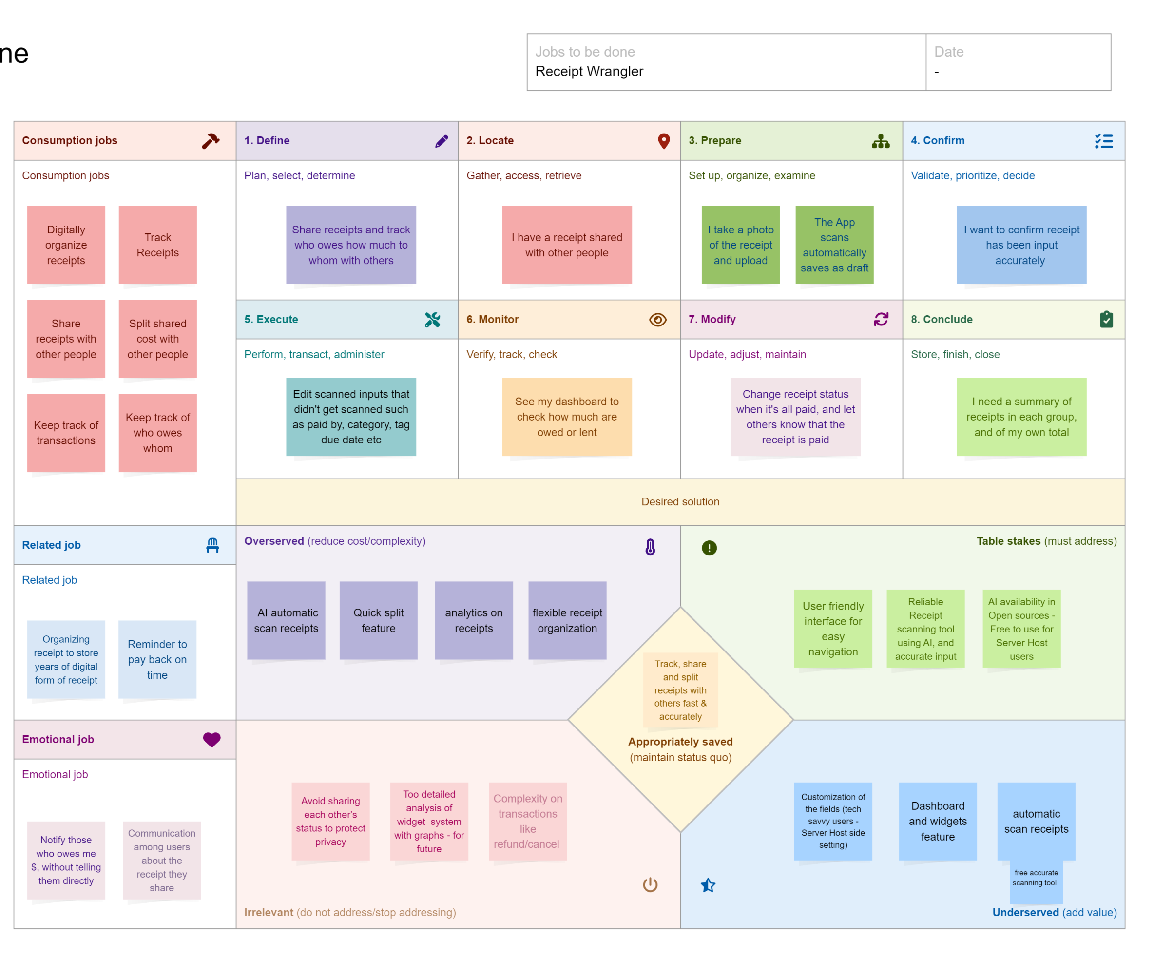
RESEARCH
The scan > edit > assign flow felt slow and scattered.
New features (like receipt comments, ai scan, and multi-split logic) had been added reactively
so we stepped back and reframed the experience around speed, simplicity, and visibility.
mobile usage had overtaken desktop and the original layout wasn’t responsive
new features added like receipt comments, ai scan, and quick split
receipt sharing and itemization
users wanted more visibility into what they owed and why
Understanding Completitors
i started with a competitor audit and lightweight user interviews to understand what people were missing in existing tools.
We looked at apps like splitwise, expensify, monshare, tricount, and various self-hosted finance tools
very few tools supported itemized receipt tracking + group ownership
many platforms assumed a single payer and passive participants
Most tools didn’t have long term receipt management, split, share and itemization feature
users wanted better visibility into shared receipts, not just total amounts
With these findings approached Jobs-To-Be-Done clearly showed us that mobile application makes sense. Most users used smartphone camera or already had pdf document on their device to upload a receipt.
These insights helped us define a unique space for receipt wrangler:
a tool built for shared use, transparent ownership, and flexible flows
with self-hosting.
Taking A Different Approach
DESIGN
Goal
Support Seamless Experience
create mobile app ux from scratch
developed an updated design system to support both platforms
Build for scale
Make uploads feel easy and flexible
redesigned the full web interface to align with the updated feature set
Build for clarity
collaborated with developers on layout, component logic, and mobile behavior

Current Design

Redesign

USABILITY TESTING
Testing the designs: Result samples
Test to see if the users can complete
Dashboard navigation: switching between group and personal views
Receipt upload: photo capture, PDF upload, and manual entry
AI-assisted itemization: scanning receipts and editing items
Filters & widgets: quick-glance summaries, date ranges, and member totals
Splitting & tracking: assigning costs, marking paid/unpaid
Dashboard felt more organized than the web version, but some testers missed hierarchy in widgets.
Receipt upload worked well, though Quick Add needed to be more prominent.
AI itemization saved time, but users expected confirmation after each edit.
Filters improved discoverability, but icons without labels slowed recognition.
Splitting was straightforward, but users wanted progress indicators for what was owed vs. settled
Manual itemization needs consideration to what could be split
Findings from Testings
FINAL DESIGN
Major Change made after the Testing
WEB
Use of side bars to create one page interaction
Problems:
Clutter page navigation,
floating button UIs causing confusions,
Modal disappearance & interaction limitation
MOBILE
Replace dropdown lists with slide sheets
Problems:
Clustered page navigation
Dropdown list of selection list feels old, and Dropdown list unable to select more than one
Consistency with Web version
WHAT I LEARNED

APPENDIX
MOBILE
Filled
Add Receipt
Quick Split
QuickScan
Mobile App Prototypes
WEB

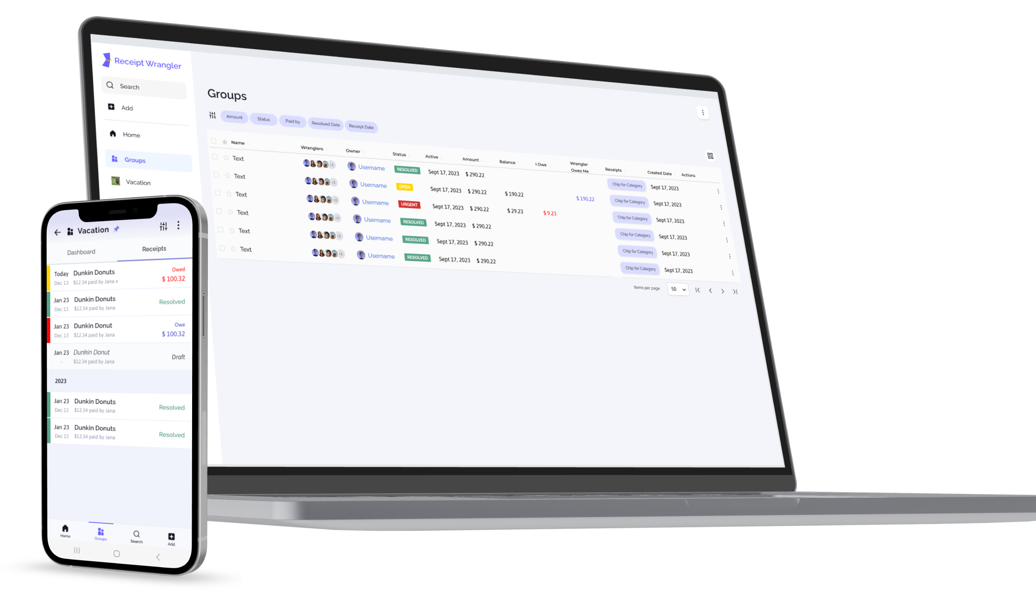
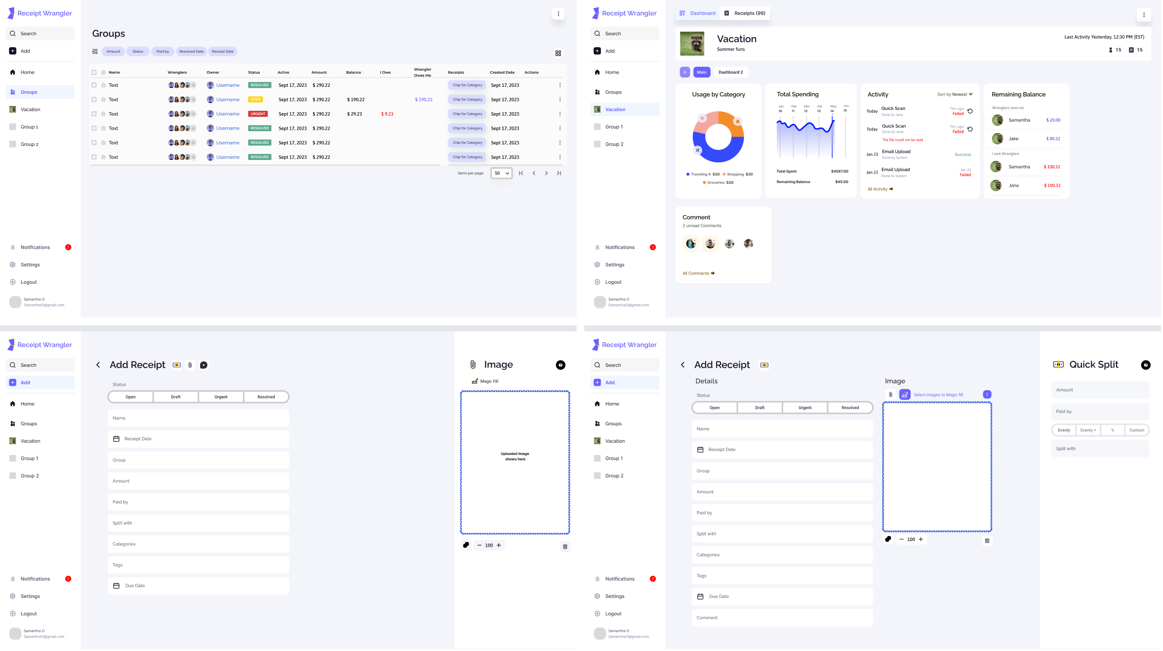
Groups

Dashboard


Add Receipt

DESIGN
Research indicates two predominant behaviors: many users prefer to immediately photograph receipts with their smartphones, fast image upload. input information, split and share.
Additionally, many others maintain digitized receipts in various storage solutions. To accommodate this, integrating functionality that allows for seamless import of receipts from existing digital repositories will enhance user convenience and encouraging broader adoption of the app.
Primary Navigation - Key tabs including Dashboard, Receipts, Groups, Payments, and Settings
Categories and tags
Receipts: Enhanced with filters for date, group, and tags, along with a quick search function
Groups: Tools for managing members and accessing group-specific receipt summaries on dedicated Dashboard
Seamless Transitions - smooth flow between tasks
Customization Options - Flexible dashboard widgets that users can personalize to fit their preferences
Userflow Happy Path
Link: Prototype Quick Scan
Server Connection - User Login - Group Creation - Widget creation inside of Group’s Dashboard - Create Receipts - Read Receipts

Ways to send a Receipt to Receipt Wrangler
Manual upload
Send email with receipt as attachment (makes a draft)
Ways to upload a Receipt in Receipt Wrangler
Add - Quick Scan - Autofills with default - manual entry
Add - Receipt- Manual Entry
Add - Receipt - Attach receipt - Magic fill
Add - Receipt - Split to itemize- manual entry
Feature 1 : AI Quick Scan
Customizable AI Prompts
Hosts can tailor AI prompts for specific needs, such as setting payment methods and identifying payment owners by the last four digits of the card number on receipts
Automated Data Entry
AI scans and extracts receipt details (vendor, date, items, prices)
Reduces manual input time and reduce repetitive work
Open Source API Options (For now)
LLava: Integrates various applications for enhanced AI interactions.
ChatGPT: Provides robust natural language processing capabilities for detailed receipt management.
Link: Prototype Quick Scan
Feature 2 : Quick Split
Link: Prototype Quick Split
Evenly
Dividing the total expense equally among all Wranglers
This default method streamlines the process for users who prefer straightforward and quick expense division.
A single tap applies the split, with clear visual feedback showing equal shares for each participant.
Evenly +
Builds on the even split by allowing slight adjustments to individual contributions.
Designed for scenarios where one participant covers an extra amount or contributes slightly more.
Users can tweak individual shares while the total remains balanced, with dynamic updates reflecting the changes.
%
Divides the expense based on percentages assigned to each participant.
Ideal for situations like shared projects or group purchases where contributions vary by proportional stake.
A slider or input field lets users set percentages, with real-time validation ensuring the total equals 100%.
Custom
Provides full control for users to manually allocate specific amounts to each participant.
Perfect for cases where contributions have been pre-determined or agreed upon in advance.
Each participant’s amount is entered directly, offering flexibility and precision.
Before Usability Testing


After Usability Testing
The design should make receipt management feel effortless while delivering the customized features necessary for effective financial tracking in both personal and business contexts.
simplify tasks like
uploading receipts,
splitting bills with friends,
tracking shared expenses
organizing receipts for personal budgeting
tax filing
Users using document tools to connect via API for easy import/export
Seamless UX
Quick Scan’s Input and Queue Process
When user sends a photo of the receipt to the hosted email, system(admin) set AI input will be filled in on “add receipts”. creating an effortless receipt filling experience.
Quick scan could fail due to many reasons. Adding a queue and streamline this process so that the User is be able to update and retry on the listed receipts without going back in and out of the receipt list.
QuickScan
Possibilitieis through card sorting, A/B testing, we finalized and settled with
Home - Receipts - Search - Add
Trials
1 Home - Search - Add - Receipts - Groups
2 Groups - Quick Scan/Add - Search
3 Search - Add - Group
4 Group - Receipts- Search - Add
5 Multi-level Navigation
Changed nav on Group’s Dashboard
Search - Add - Receipt
Changed nav on Create Receipt
image - Split - Quick Scan
Creating Navigation
USABILITY TESTING
Usability
How easy is it for users to use the tool?
Are there any challenges or confusions encountered during use?
Searchability Improvement
How effective is the receipt filter in improving the searchability of receipts?
Do users find what they are looking for quickly and accurately?
Suggestions for Enhancement
What additional features or improvements do users suggest for the receipt filter to make their search experience more efficient?
Customization and Usefulness
How do users find the process of creating and customizing widgets on the Group Dashboard?
Does the customization enhance their overall experience and meet their needs?
Cardsorting & A/B Testing I (Navigation)


Before Testing (Add)
After Testing II (Add)


Now: After Testing II (Split)

Before Testing (Split)

After Testing I (Split)

Now: After Testing II (Split)